

JioMart CMS
A campaign dashboard portal designed to make campaign scheduling for marketing easier
Role
UI/UX Designer
Duration
3 to 4 months
Team
2 designers
Tools & Methods
Microsoft Teams- Requirement gathering, Brainstorming
Balasamiq- Wireframing
Adobe XD- Prototyping
Overview
ABOUT
JioMart is one of India's largest E-Commerce digital products (website & mobile application) used by 200 cities and towns across the Indian subcontinent. This is a joint venture of Reliance Retail and Jio Platforms to reach out to people across India for all kinds of shopping ranging from grocery to apparel.
PRODUCT DESCRIPTION
JioMart Campaign Portal is a website-based content management system designed to meet the needs of the JioMart Campaign Team. This portal has been designed for an internal team in order to track and ease the campaign (advertisements, posters) configurations of MyJio and JioMart.
Content is under NDA - Presented most of the work done in the 1st sprint
Business goals
.png)
Facilitating campaigns

Better management
Improving the system
My role
My work involved doing the following design tasks:
-
Gathering user requirements
-
Brainstorming ideas
-
Wireframing the final idea
-
Designing high-fidelity mockups on Adobe XD
Further, I also performed UI testing with developers and use case testing as well as redesigning the user interface of the website iteratively with the product manager.
Design Challenge
"How might we help the jiomart campaign team to operate campaign configurations for enhancing better engagement?"
What is JioMart CMS?
JioMart Content Management System(CMS) is also called the JioMart Campaign Portal.
It was been created for :
-
inhouse-developed utility
-
helping to improve campaign management capability
JioMart aimed to compete with major players like Amazon, BigBasket, Flipkart SuperMart, and Grofers. To achieve this goal, they required a campaign management system that could provide the team with the ability to manage campaigns on the go.
.png)
.png)
.png)
.png)
Requirement Gathering
1.
Designing a website-based product for the JioMart Campaign Team on the basis of familiarity and convenience.
2.
There should be a proper categorization of campaign modules.
3.
The system needs to be flexible to use.
4.
Functionalities like upload, create, view, and settings are needed.
Brainstorming
Understanding the requirements made me start to look at various ways to display the information, keeping in mind that it should be easy to traverse through the system.
We sat together for a brainstorming session of Crazy 8s to come up with ideas for addressing our design challenge that will help to address the requirements as stated.
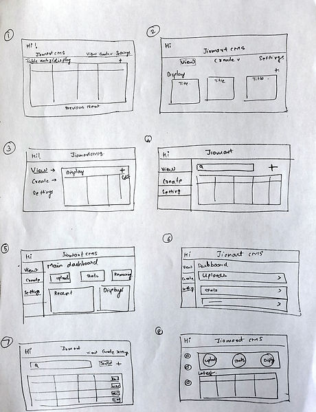
Figure- Crazy 8s ideas
Prototyping
Low- fidelity wireframes
Ideas generated from Crazy 8s sketching helped in eliminating and consolidating the ones which aligned more to 2 aspects:
-
Technological feasibility
-
Inclusion of functionalities
As per that, we came up with the following wireframes.
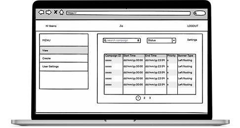
View Campaign Schedule
-
Tabular view of campaigns with time, type, and priority
Schedule new campaign
-
Input entry fields for scheduling campaigns

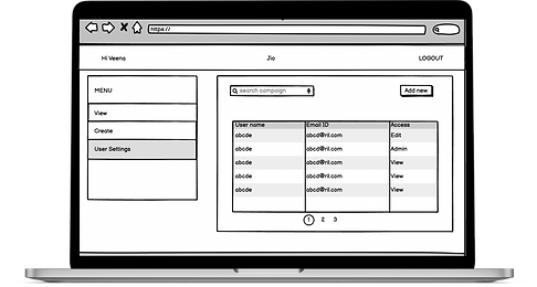
User settings
-
Tabular view with a list of users that have access to the portal.
User testing
The wireframes were used to conduct user testing with 2 to 3 members of the campaign team. We laid down the approach to find out whether they were able to upload and manage a campaign successfully.
What was liked
-
Much better than the present system.
-
Clean wireframes
-
Almost all the data required to schedule & manage a campaign is present.
-
Showing all information in a tabular view is clear and well-comprehensible.
What needs to be worked on
-
Input information is unorganized in the schedule campaign screen.
-
Not able to clearly understand how to schedule a campaign.
-
An edit option is required for every campaign.
-
The status of a campaign is not present
Redefining features
According to the results gathered from user testing, we sat with the product manager to establish the additions to the design requirements.
The following additional features were decided as per the design requirements addition:
1.
Categorization into modules is needed for a better understanding of different segments for scheduling a campaign.
2.
A screen for uploading a creative is required
3.
A calendar option is needed for viewing campaigns
4.
The preview option should be present with the proper specifications of the campaign.
High Fidelity Prototypes
Redefining the requirements provided us with a broader scope for designing. Consolidating all the information we started to design the 1st iteration of high-fidelity prototypes.

View campaign schedule
-
Clear tabular view of all the campaigns in detail.
-
Status of the campaign providing proper understanding.
-
The calendar view helps the display in a time formatted way.
Schedule new campaign
-
Module categorization in terms of when, where, what, and preview.


Module display - Schedule new campaign
-
One of the modules for example "where" provides a better-organized way of input with respect to the platform the campaign needs to be scheduled.
User settings
-
Clear tabular view with a list of members and users having what kind of access is displayed
-
The "Add new" button helps to add a new user and provides a type of access (only by admins).
-
Changing access of a user only for admins.

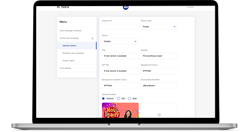
Upload creative
-
Proper input display with clear information for uploading a creative(banner, image, video).
Learnings
This project was my first hands-on user experience design work.
-
So much fun ideating the design with my senior designer and the product manager.
-
Grateful for getting the opportunity to work on a project from the initial stages.
Understood the importance of UI with UX
Relating the requirements while doing the Crazy 8s idea generation was a tricky one because I had to create a usable and useful interface and focus less on the aesthetic design. This was a product that focused more on the UI perspective.
Collaboration with different people
I got to interact with product managers and developers during the sprint cycle. I understood how everyone's input changes design decisions in order to keep them aligned with project goals.
Constructive feedback and support
I made mistakes and came to stages where it was difficult to proceed but my senior designer was very supportive throughout and helped me bring my views onto the screen in a more promising way.
Thank you for reading!
If you want to continue exploring more of my work 👇🏼